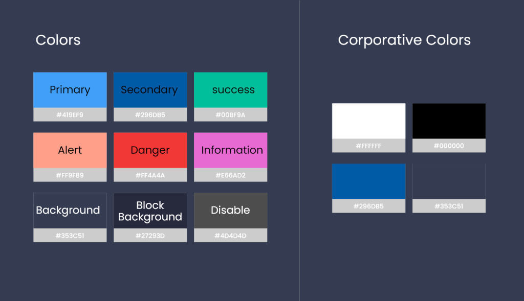
The use of color in interface design plays a key role in visual communication, emotion creation, legibility, organization, and visual hierarchy. Careful use of color enhances the user experience, facilitates understanding of the interface, and contributes to visual identity and brand consistency.

We have assigned a universally (more or less) understandable semantic meaning to each color.
In our case the cold colors correspond to positive states and as we increase the temperature the color communicates alert or danger.
- Primary :: #419EF9 :: Dodger Blue :: Primary color to indicate actions to be carried out in the future.
- Secondary :: #296DB5 :: Royal Blue. :: Secondary color for successful ongoing actions.
- Success :: #00BF9A :: Sea Green :: Identifies successful actions/communications.
- Alert :: #FF9F89 :: Coral :: Non-critical events that may generate failures in the future.
- Danger :: #FF4A4A :: Crimson :: Critical conditions that need to be urgently reviewed and addressed.
- Information :: #E66AD2 :: Orchid :: Highlights of decision-useful information.
- Background :: #353C51 :: Dark Slate Blue :: Default background color.
- Block background :: #27293D :: Midnight Blue :: To generate contrast in the info blocks.
