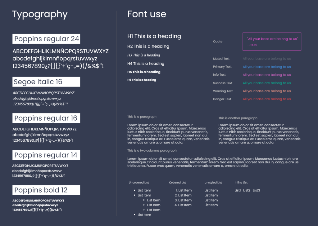
The Poppins typeface is a suitable choice for the development of an interface due to its outstanding qualities. First of all, it offers excellent legibility thanks to its clear and easy-to-read character structure. This is essential to ensure that users can perceive information without difficulty, regardless of the size or device they use.
In addition, Poppins is a versatile typeface that provides different weights and styles to suit the needs of the interface design. These different weights allow highlighting of important elements and hierarchizing information in an effective way.
In terms of aesthetics, Poppins has a modern and elegant look, which is in line with current design trends. Its clean, contemporary style conveys a professional and up-to-date image in the interface, contributing to a visually appealing experience for users.
An additional advantage of Poppins is that it is freely available as an open-source typeface. This makes it easy to integrate it into interface development without incurring additional costs or licensing issues.
Finally, Poppins is compatible with various operating systems and web browsers, ensuring correct display on a wide range of devices. This compatibility is essential to provide a consistent and satisfying experience for users, regardless of the device or platform they use.
In conclusion, the Poppins typeface is a suitable choice for interface development due to its legibility, versatility, modern style, free availability, and compatibility with different devices. These features contribute to an attractive and functional interface, enhancing the user experience.
The Segoe Italic typeface is a beneficial choice for explanatory texts for several reasons. First, the italic variant of the Segoe typeface adds a visual distinction that helps differentiate explanatory text from the main content. The slant in the typeface conveys a sense of emphasis or prominence, allowing additional or explanatory information to stand out.
In addition, Segoe Italic offers excellent legibility. Its sleek and stylish design makes explanatory text easy to read, even in smaller sizes. This is essential to ensure that users can quickly understand and absorb supplementary information.
The Segoe typeface, in general, is characterized by its modern and professional appearance. By using the italic variant, a touch of sophistication and style is added to explanatory texts, which can enhance the overall appearance of the interface and convey a sense of attention to detail.
